How to create an illustration: Basic structure
Illustrations are one of the top design trends now, with more and more ways to add beauty and usability to digital products. Today we offer you to get to basics of vector illustration together with an illustrator Anta Alek. She has prepared a big set of tips, examples, and practices for those who start their way in digital illustration or want to create original vector images for their interface designs. So, welcome to learn about colour, light, composition, perspective, preparing files for a client and skills to progress in illustration.
When Shadow Meets Light
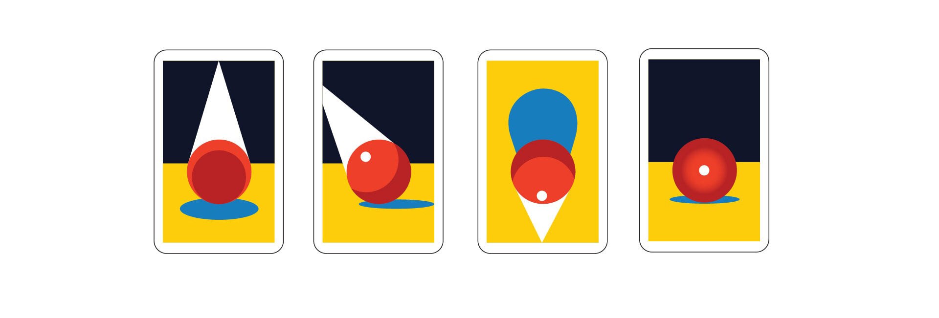
Let’s look at a ball with light falling upon it. As illustrators, we have to analyse what is happening at the moment. When light strikes upon an object, it looks realistic for our eye which means the object has: highlight, light, half-tone, shadow, and reflected light. Excluding these parameters from the illustration, we’re moving from volumetric objects to flat ones. That’s how a flat technique comes up. Coming across artworks by other designers, you are recommended to analyse which parameters (only light and reflected light/ light and shadow/ highlight and half-tone, etc.) were included in the illustration, and how far the designer went away from a realistic representation of the object to a flat one. In my example below, the light and reflected light were excluded. The object saved only highlight, half-tone and shadow, and this way we got a ball more stylised and flat. So, modulating the volume this way, we control how realistic an illustration can be and whether it fulfils our task in general.

A bit of theory
In the light, the colour of an object always looks lighter than its original. Half-tone is a meeting point of shadow and light. That’s exactly where our eye identifies a real colour of an object. When an illustrator creates objects using gradients, a point to keep in mind is that the true colour of the object reveals at the joint of light and shadow. Due to the fact that work is often done by a warm-cold method, the transition area at the joint of warm and cold, of light and shadow, is where we can probably get a “dirty” colour. To avoid that, the colour should be thoroughly selected and intentionally “purified”. For instance, using a CMYK colour model, it’s necessary to check how many elements the colour is comprised of (ideally, there should be two main and the third as an additional one used at a minimum). If there are four elements, it becomes more difficult to control an impression and keep the colour vibrant and bright.
Why would you need this knowledge if it’s possible to draw in a flat manner? Now, we are equipping you with information that will enable you to work in absolutely various artistic techniques.
the Light Sources
A source of light is another aspect to consider. For some illustrators, selection of a specific light source is a signature line of their portfolio, a factor of its high recognisability.
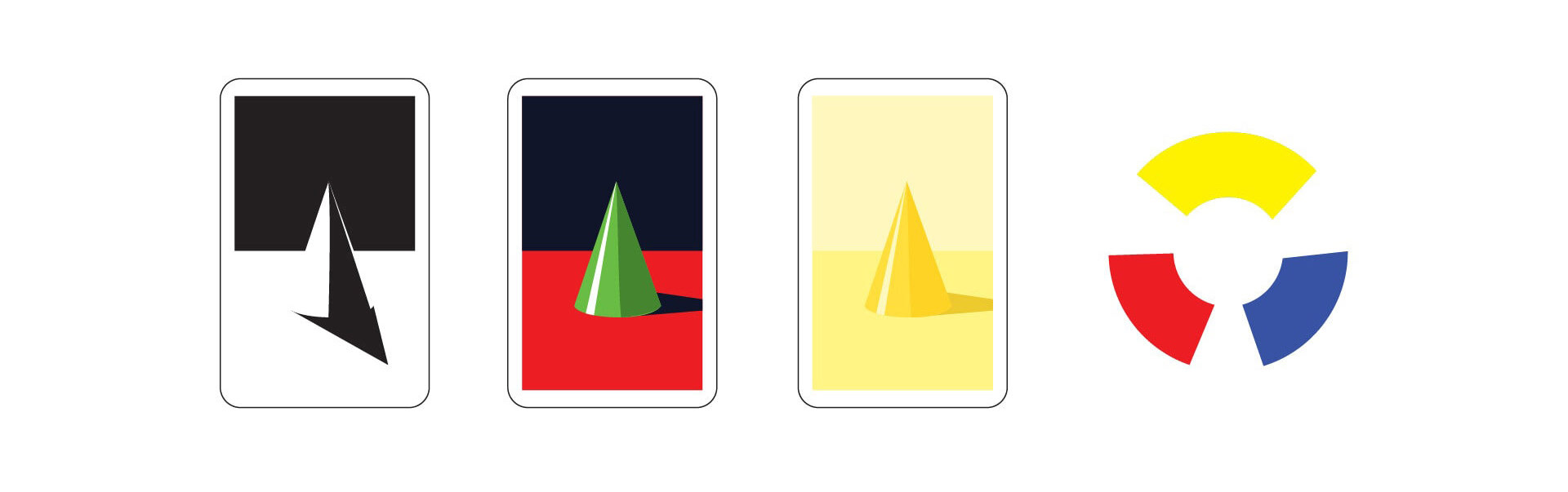
A backlight means that the light source is placed behind the object. That kind of light source has an impact on the emotional perception of an object or character which seems to be distant, mysterious, filled with uncertainty, somehow hidden from the viewer, as a character or object is mostly in shadow and just a silhouette is exposed as a hint of what the image creator wanted to tell us.
It’s always worth analysing what light source will highlight a desired emotion to the maximum extent. There are stereotypes that certain characters or episode scenes go hand in hand with specific light sources. For villains, thieves, swindlers, and characters experiencing fear, a bottom lighting is applied; Hollywood light is used for divas and famous people; and backlight serves well for “shady characters” or people that will be introduced to the world soon, for instance, a superhero that is unknown yet, entry of a hero.
Color
At the appearance of light in space, our eyes can automatically distinguish the colours of objects, each of which has its molecular structure, and so reflects or absorbs a given light spectrum. Talking about physical objects, an eye is able to see the reflected light spectrum only.
Recommendation for reading: “The art of colour” by Johannes Itten
The greatest contrast is the one between black and white. The next one is between the basic colours of the colour wheel: blue, red and yellow. Based on the opposite colours of the colour wheel, we can build various contrast pairs. The contrast is lowering while moving away from the basic colours. The following impressions and emotions can be conveyed via contrast: fury, energy, confrontation, maximum, power, diversity. Nuance is a minimal shading-off of the colour, and as a result creating the feeling of tranquility, peacefulness, and equality.
The next aspect worthy of attention is warmth and cold of colour. Let’s get back to the colour wheel that has a temperature: gradations from yellow-green to the red are considered to be warm gradations; colours from burgundy to blue-green are cold. The green colour is defined as both warm and cold. Perception of a colour in a vector illustration is highly relative, sometimes cold colours seem to be warm, as they are surrounded by other much colder colours. Thus, we should practice a lot to develop a well-done palette in our artworks.
Interesting experiments can be observed when a professional works with coloured light sources.
Do your best to look over your artwork to check the following:
in natural light you get cold light and warm shade; in artificial light – vice versa.

An illustration can be considered harmonic if its colour spots are balanced in tone, colour, and mass; if shapes are skillful composed and a meaningful message is distributed according to the significance level, from core to details.
The colour, light, and shape help us to highlight the core – a meaning that we want to convey to a viewer.
Static and Dynamic
An image can be called static if objects are built up as close as possible to either X-axis (horizontally) or Y-axis (vertically).
The dynamic image is the one where most of the objects are placed along the line of 45°.

Working on the set of vector illustrations, everyone faces a question of how to make it solid and unified. A balance of statics-dynamics of the figures and color spots should be nearly the same in every image. Over-static or too dynamic ones will “fall out” of the main line, feeling like aliens.
The following emotions or qualities are conveyed via statics: tranquillity, balance, stability, passivity, etc. Dynamics transfer: determination, movement, activity, and energy.
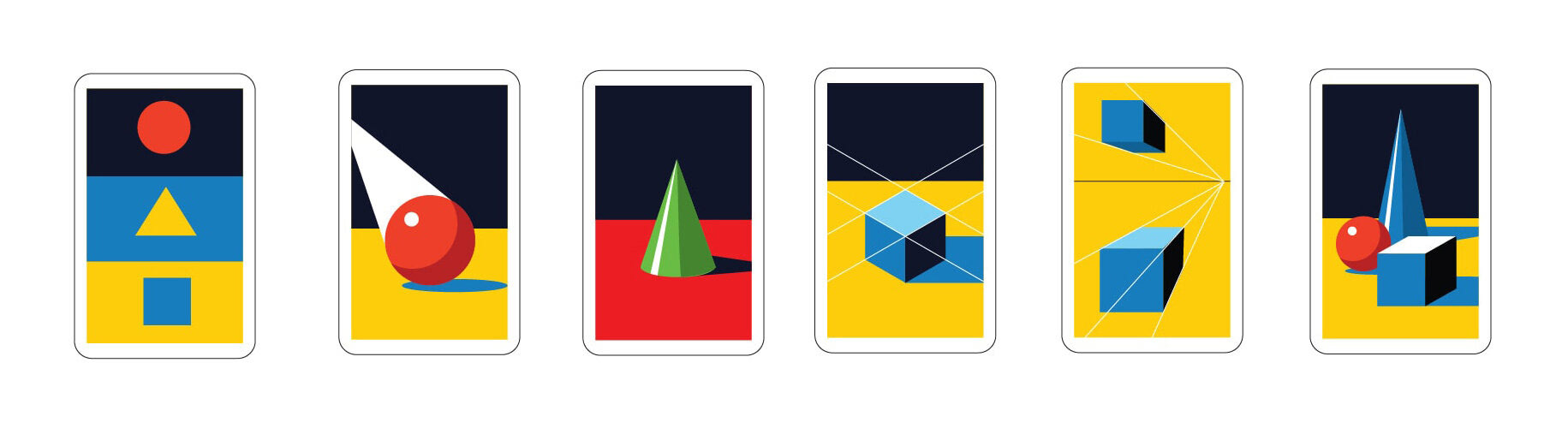
Perspective
Types of perspectives: one-point, inverted, isometric and eastern space.
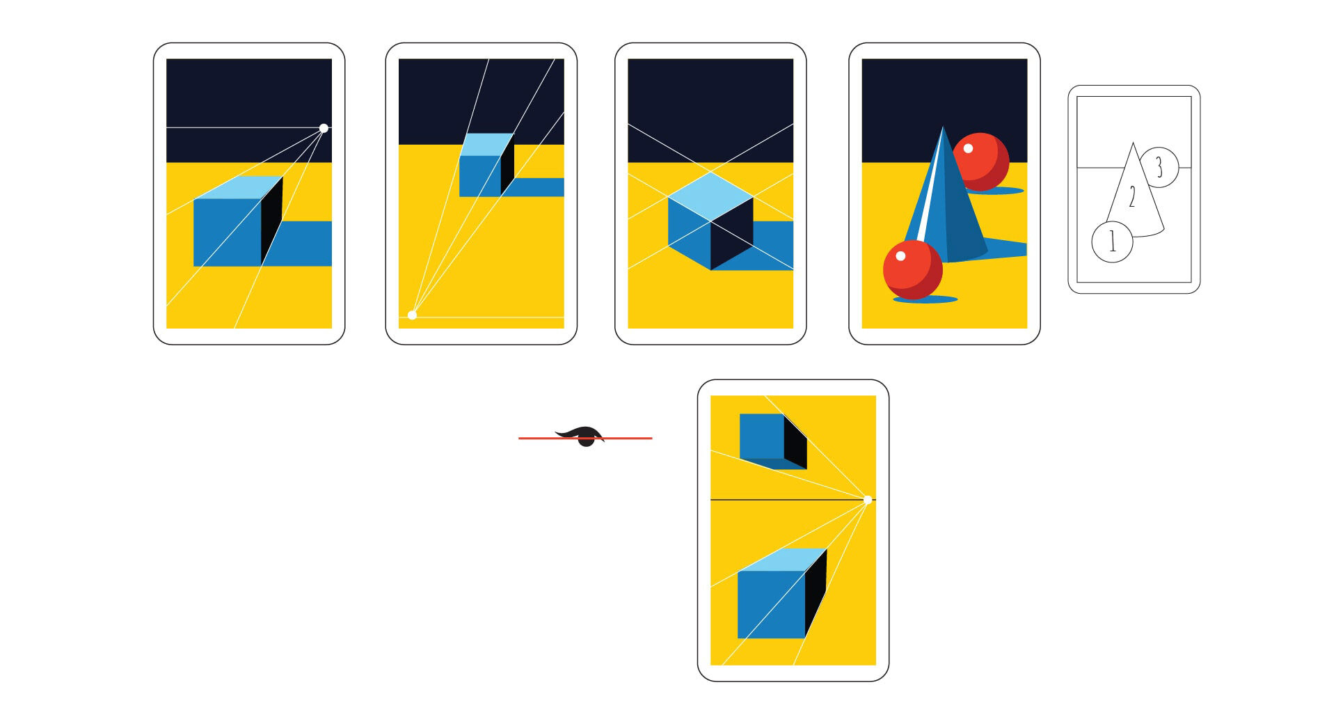
One-point perspective is a technique of depicting objects in space when there’s one or several vanishing points according to which an object is reduced in size.
Inverted perspective is a type of perspective when the vanishing point is placed as if it is inside the viewer. This perspective creates kind of symbolic space and is commonly applied in icon-painting, encapsulating goodness directed to a viewer.
Isometric perspective is an angle without foreshortening, when three sides of an object are visible.
Eastern space is a kind of space where objects are built up into composition one by one, regardless of the perspective.
The horizon line is a line located at the eye level. It reflects a psychological interaction between a character and a viewer in illustration. If the object is above the horizon line, it’s a dominant position, superiority; and if it’s below the horizon line, respectively, it will be a recessive, depressed position.
Now, let’s bring together all the aspects: shaping, colour, light, perspective, horizon line, and composition.
Shaping
All the illustration and each particular object/character can be split into graphic primitives: triangle, circle, and square. If we’re drawing a wavy hair, it is actually a set of alternating cylinders; when drawing an eye, it is a sphere installed into an orbit. If you intuitively feel that there’s something wrong with the object, it’s time to switch on the logic, split it into primitives and verify the construction. So, follow your heart and draw, but after that engage an analytical approach. Such alternation makes it possible to practice imagination and sensation as well as estimate an artwork mathematically.
When you’re mastering a profession for the first couple of years, there’s always a question: where to move on? Every aspect, as time goes by, should transform into a new more proficient skill. What tasks do you set for yourself on daily basis to hit a new level, to go even deeper into a subject?
Some of skills to become a Successful Illustrator
Here are four skills that are a great help in becoming a successful illustrator:
-Master academic drawing and painting in a free mode.
-Several private lessons a month with a professional tutor would be enough.
-Develop your spatial thinking
Before creating a picture, imagine it as a 3D model and rotate, walk around it to select the best view, perspective, light source, and capture it in mind. As if you find yourself in a static shot of a movie you are directing and you can change everything by your preferences.
To do so, it’s necessary to practice remembering real-life scenes. For instance, concentrate on a situation in the park for 5-10 minutes, close your eyes, simulate it in imagination, then open your eyes and compare it to the reality: what was missing, what’s got distorted and what you captured well.
Keep advancing the knowledge of the English language (B2-Upper Intermediate), of course, if you are not a native english speaker.
That is essential for signing contracts and mailing to foreign customers, Skype conferences on the project, communication and attending workshops by foreign designers.
B2 is a level that allows you to communicate freely, think in the language, produce texts from time to time and easily reply to letters.
Constantly update your portfolio, communicate in social media, participate in interviews, workshops, distribute fresh projects to existing and prospective employers not less than once in 3 months.
All the illustrations in the article are made by and belong to AntaAlek.
The original article was published on Telegraf Design